
Themes
Add Theme to Hexta Docs
Overview
Hexta Docs adds its own colors, animations, and utilities with Tailwind CSS preset.
Setup
Only Tailwind CSS v4 is supported, the preset will also include source to Hexta Docs itself:
@import 'tailwindcss';
@import 'hexta-ui/css/neutral.css';
@import 'hexta-ui/css/preset.css';
For Shadcn UI, you can use the shadcn preset instead. Hexta Docs will adopt colors from your Shadcn UI theme.
@import 'tailwindcss';
@import 'hexta-ui/css/shadcn.css';
@import 'hexta-ui/css/preset.css';
See Colors for details.
Preflight Changes
By using the Tailwind CSS plugin, or the pre-built stylesheet, your default border, text and background colors will be changed.
Light/Dark Modes
Hexta AI supports light/dark modes with next-themes, it is included in Root Provider.
See Root Provider to learn more.
RTL Layout
RTL (Right-to-left) layout is supported.
To enable RTL, set the dir prop to rtl in body and root provider.
import { RootProvider } from 'hexta-ui/provider/<framework>';
import type { ReactNode } from 'react';

export default function RootLayout({ children }: { children: ReactNode }) {
  return (
    <html lang="en" suppressHydrationWarning>
      <body dir="rtl">
        <RootProvider dir="rtl">{children}</RootProvider>
      </body>
    </html>
  );
}
Layout Width
Customize the max width of docs layout with CSS Variables.
:root {
  --fd-layout-width: 1400px;
}Colors
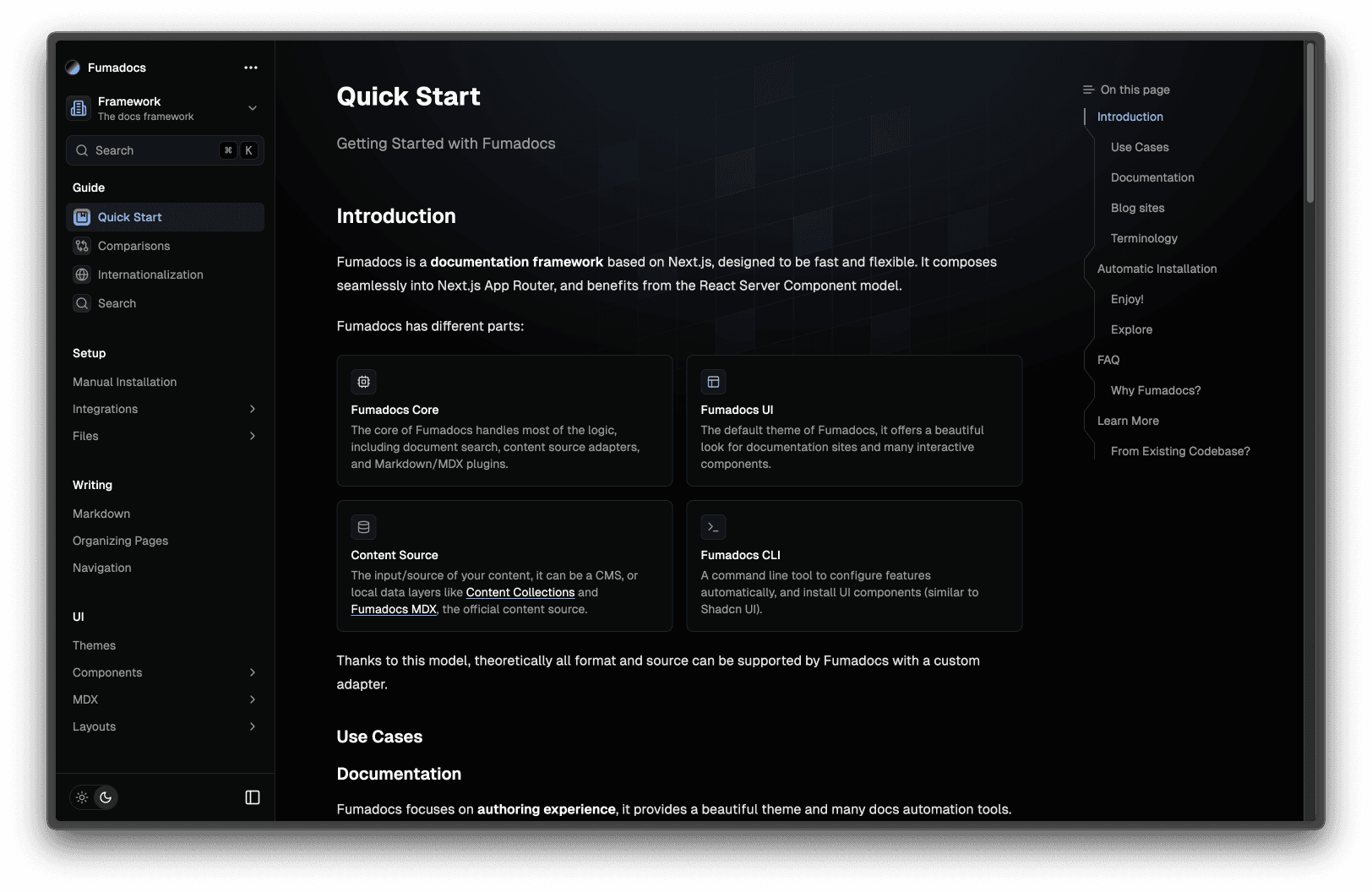
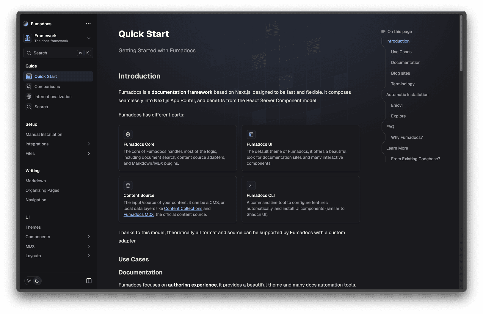
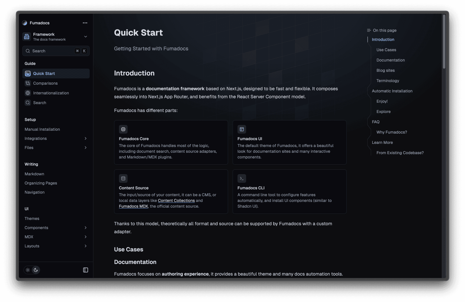
It comes with many presets out-of-the-box, you can pick one you prefer.
@import 'hexta-ui/css/<theme>.css';
@import 'hexta-ui/css/preset.css';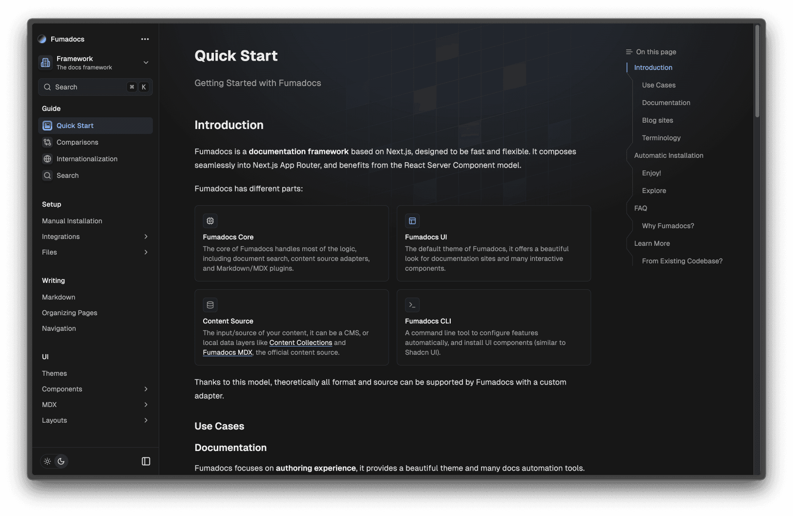
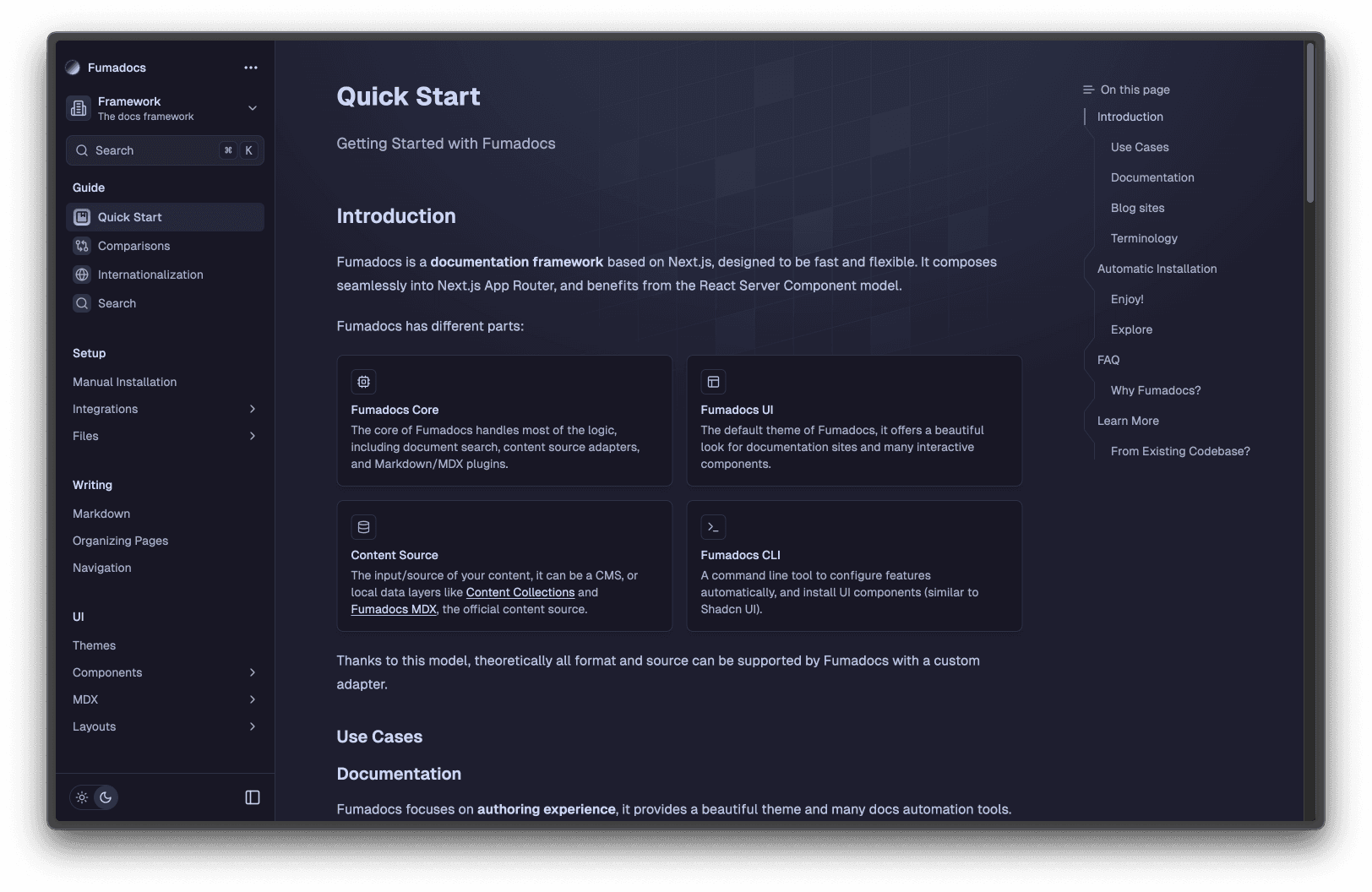
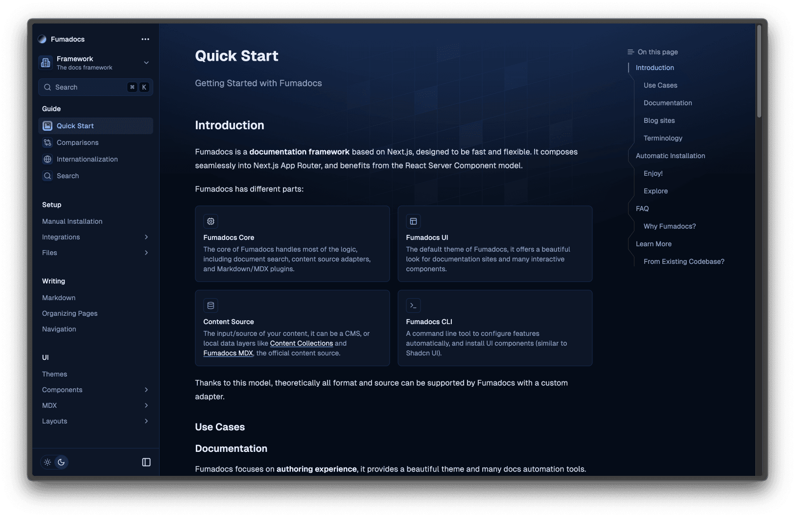
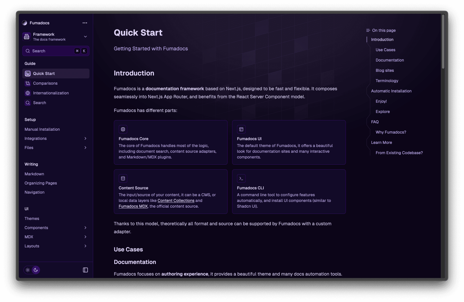
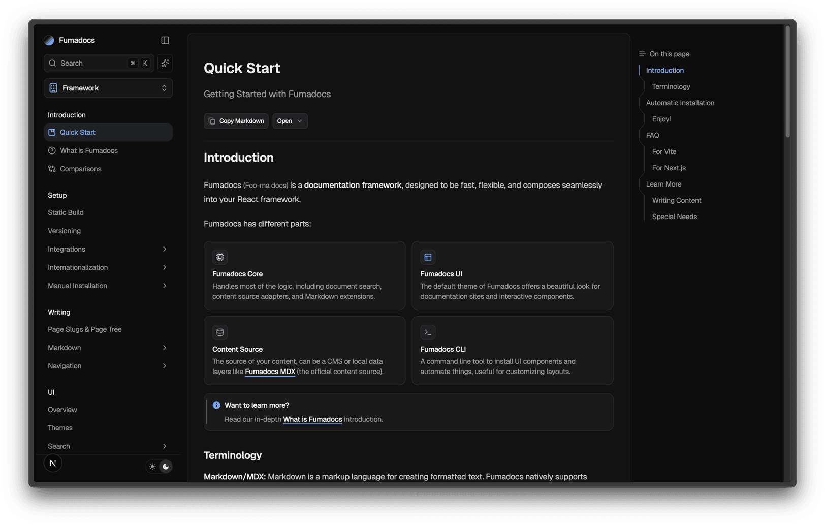
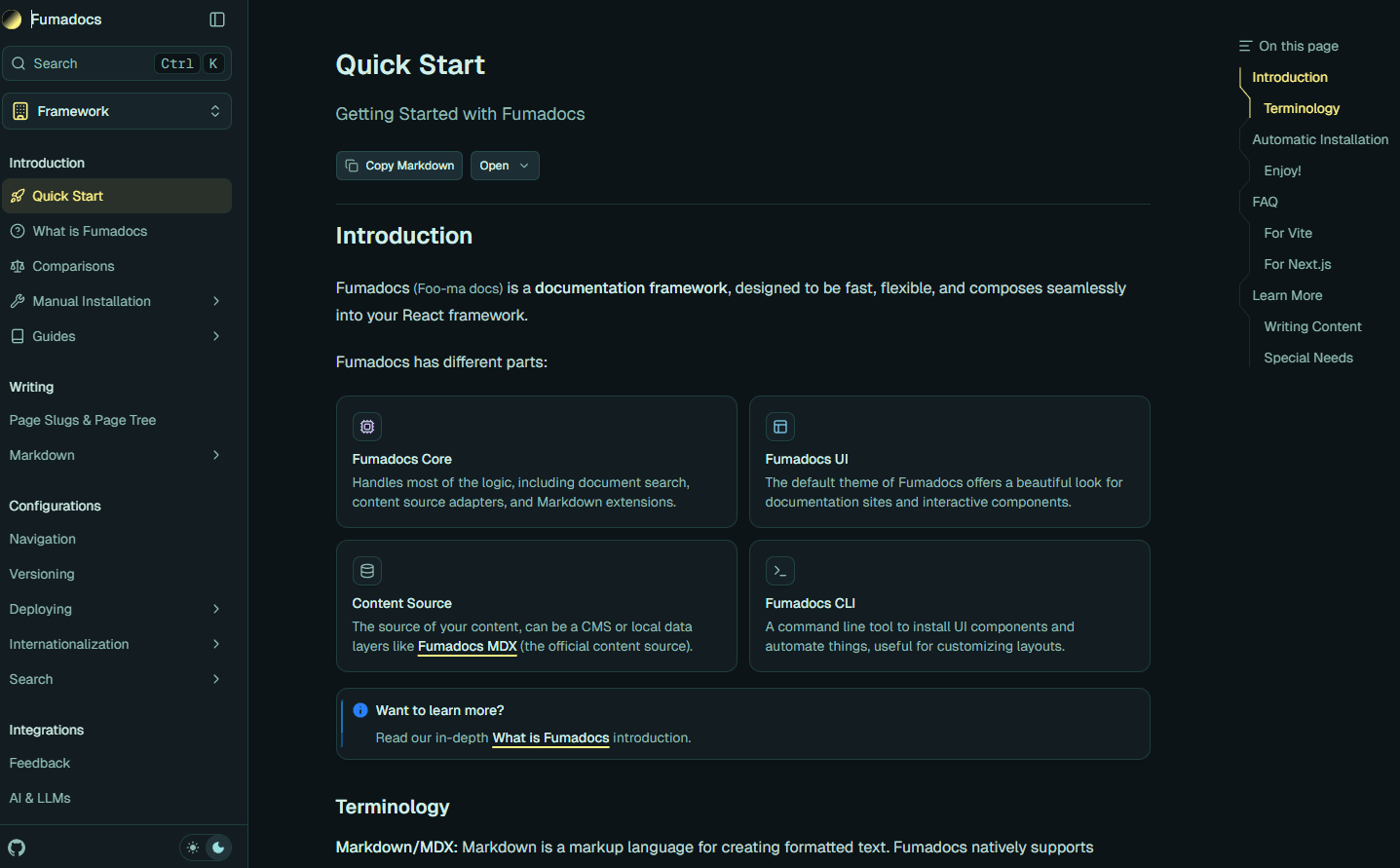
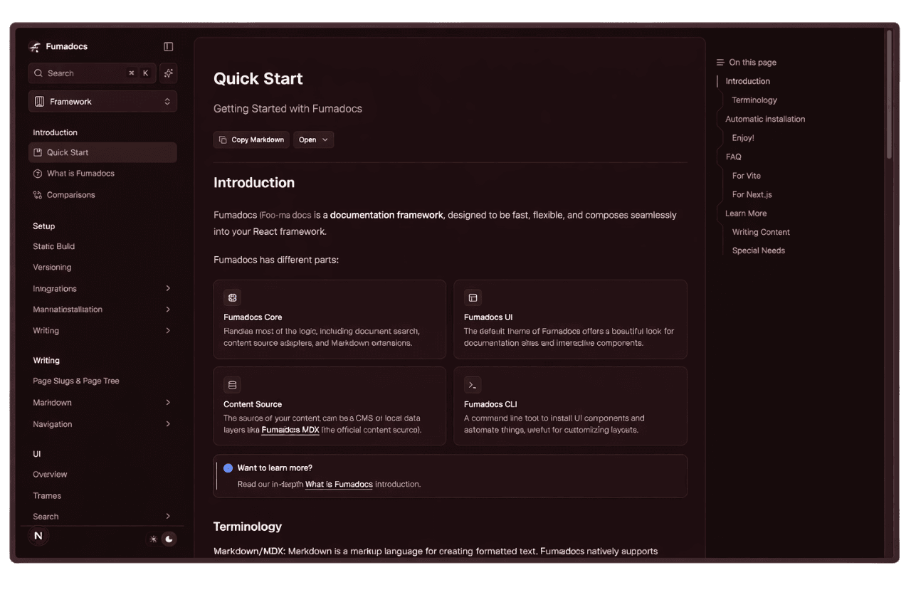
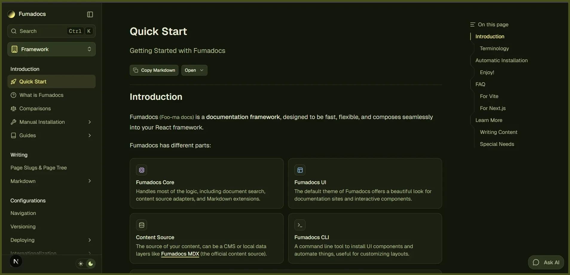
The design system was inspired by Shadcn UI, you can also customize the colors using CSS/Theme variables.
@theme {
  --color-fd-background: hsl(0, 0%, 96%);
  --color-fd-foreground: hsl(0, 0%, 3.9%);
  --color-fd-muted: hsl(0, 0%, 96.1%);
  --color-fd-muted-foreground: hsl(0, 0%, 45.1%);
  --color-fd-popover: hsl(0, 0%, 98%);
  --color-fd-popover-foreground: hsl(0, 0%, 15.1%);
  --color-fd-card: hsl(0, 0%, 94.7%);
  --color-fd-card-foreground: hsl(0, 0%, 3.9%);
  --color-fd-border: hsla(0, 0%, 80%, 50%);
  --color-fd-primary: hsl(0, 0%, 9%);
  --color-fd-primary-foreground: hsl(0, 0%, 98%);
  --color-fd-secondary: hsl(0, 0%, 93.1%);
  --color-fd-secondary-foreground: hsl(0, 0%, 9%);
  --color-fd-accent: hsla(0, 0%, 82%, 50%);
  --color-fd-accent-foreground: hsl(0, 0%, 9%);
  --color-fd-ring: hsl(0, 0%, 63.9%);
}

.dark {
  --color-fd-background: hsl(0, 0%, 7.04%);
  --color-fd-foreground: hsl(0, 0%, 92%);
  --color-fd-muted: hsl(0, 0%, 12.9%);
  --color-fd-muted-foreground: hsla(0, 0%, 70%, 0.8);
  --color-fd-popover: hsl(0, 0%, 11.6%);
  --color-fd-popover-foreground: hsl(0, 0%, 86.9%);
  --color-fd-card: hsl(0, 0%, 9.8%);
  --color-fd-card-foreground: hsl(0, 0%, 98%);
  --color-fd-border: hsla(0, 0%, 40%, 20%);
  --color-fd-primary: hsl(0, 0%, 98%);
  --color-fd-primary-foreground: hsl(0, 0%, 9%);
  --color-fd-secondary: hsl(0, 0%, 12.9%);
  --color-fd-secondary-foreground: hsl(0, 0%, 92%);
  --color-fd-accent: hsla(0, 0%, 40.9%, 30%);
  --color-fd-accent-foreground: hsl(0, 0%, 90%);
  --color-fd-ring: hsl(0, 0%, 54.9%);
}
Typography
We have a built-in plugin forked from Tailwind CSS Typography.
The plugin adds a prose class and variants to customize it.
<div className="prose">
  <h1>Good Heading</h1>
</div>
Use prose-sm alongside prose for smaller typography with an optically adjusted font weight:
<div className="prose prose-sm">...</div>The plugin is supposed to work with Hexta Docs's MDX components, it may conflict with @tailwindcss/typography.
If you need to use @tailwindcss/typography over the default plugin, set a className option to avoid conflicts.
@import 'tailwindcss';
@plugin "@tailwindcss/typography" {
  className: wysiwyg;
}
How is this guide?